The Bold Transformation of GF Smith: A New Era in Paper Branding
Introduction
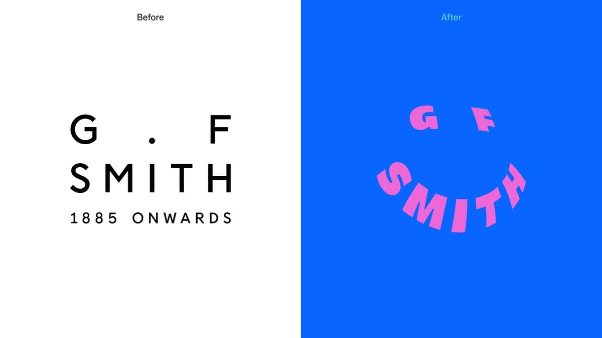
GF Smith, a beloved British paper company, has undergone a radical rebranding that has sparked intense discussions among designers and creatives alike. Previously known for its classic identity established in 2014, the new look, developed by the agency TEMPLO, marks a significant shift towards a more vibrant and modern aesthetic.
The Rebranding Process
The rebranding process was always going to be challenging due to the company's long-standing heritage, noted with the tagline 'from 1885 onwards'. The new design has injected a joyful and playful character into the brand, aligning it with contemporary trends while attempting to retain its historical essence. However, the reactions from the design community have been mixed.
Mixed Reactions
Observing the reactions, comments have ranged widely. Some critics have expressed their displeasure, labeling the redesign as "a significant misstep" and even "visually quite upsetting". Conversely, others have praised the new design, calling it "so simple yet so dynamic" and "confident in its playful adaptable image".
Image credit: GF Smith
Conclusion
The conversation around GF Smith's rebranding highlights the subjective nature of design and the challenges that come with modernizing a long-established brand. As the dialogue continues, it will be interesting to see how this new identity influences the company's future and its reception in the market.
 Image credit: GF Smith
- #branding
- #design
- #marketing
- #rebranding
- #industryinsights
Comments · 0